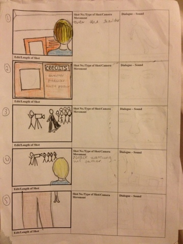
These are our storyboards that we created in class to give a guideline of what our filming and shots are going to be. The first couple of shots are of our shots are of the villain 'Zorak' these give a brief description of his childhood and the reason why is evil. We are then shown a series of people reading newspapers to represent the girls being famous and helping people, even in small tasks, individually saving the day. We are going to have a close up of the young Zorak into the current one. The end shot is Zorak putting down the newspaper and seing the girls form together, like in avengers. This shows the clear binary opposition of evil vs good.
This is an example of the newspaper of all the girls together which is presented later on in the title sequence. This hints our storyline as it shows them together in this but seperate in the others we have made.
One of the props used in our title sequence. Throughout the title sequence we have many people looking at newspapers about the fantastagirls. This is to show their individually and later on we have a newspaper of the girls together.
Out of the 4 parts; cinematography, directing, design and props, and location and makeup, i got chosen to do design.
we each had a vote to see what would suit us best. From this I'm now the design and prop. so far i have created props for the title sequence and the cast list is pending. So far we have made a sequel of when and where we are filming.
Props:
Camera
Tripod
Newspapers
Dolly
Magazine
Ipad
I have took the feed back and edited my blog. i have added things that have been missing. Labels can be added to make it easier for the person viewing it, this means that people can go straight to the place they want to. I have also made a label for my Journal so that when we do something new on our project i can write a post about what has been done and whether there was any problems.
There is an immediate indication that the film is directed towards children. It stars with an up beat music; this can give viewers an exciting feel to the film. A high-pitched ringing song, which alerts the viewer.
The typography of the title is used in red. This could symbolise the danger in the film, as we know the film is a children’s action film. The title is bold which goes in at the middle. This again shows the connotations of a children’s film. A light then over covers this. It gives conventions of a stereotypical superhero.
Each individual superhero is shown and their powers. This gives each superhero there own chance to show off and give an insight to what the film is going to be about.
The incredible a title sequence is a cartoon animation, through out the title sequence the animation continues but the animation becomes extremely fast so the animation looks almost like shapes. This is also used to show the actors names layered over the top. This relates to Saul Bass's work with shapes in title sequences. The shots are shown short and quick and in each shot their is a different character pulling a fighting pose, and this could relate to children's books, the one image on each page. This shows the viewers the main characters and their different powers that might come with the film; also the characters are punching towards the screen that brings back the connotations of an action film. When this happens the tempo in the music goes up with it to link with the action and gives a greater effect.
You also see the villain throughout the shots and this also reinforces the genre of the film.
The director’s names and other characters in the film have been placed into bold and solid typography, it appears almost as if it has been written in italics, which looks as if it has a fast movement, this could indicate what is yet to come in the film. The general order of the films is what is expected in a title sequence. Showing who the film is made by first and the actors next. This is so the audience know who it is made by, this could also give an idea of what the film is about if the audience knows of their work.
The sequence itself focuses you to pay attention as each shot is fast and bright. This reinforces the idea that it alerts the reader. When the design people are shown, an image of the work is shown. For example when the music producer is shown there are music notes above so you know what it is going to be without reading it. Although the sequence is a animation it still uses shot types to help show the characters. For example when a villain is shown a low angle shot is used to make him look powerful and inferior.
Shots are made for shot already on screen this makes the sequence snappy and fast. While still leaving hints of what is going to happen during the film.
Theses are the two types of typography sansSerif and Seif
Serif is Sans serif
with a flick type ends onto the bottom of the lettering which is used to make the font look more professional. This can be used if someone is trying to make the typography look as if its been written on a type writter.