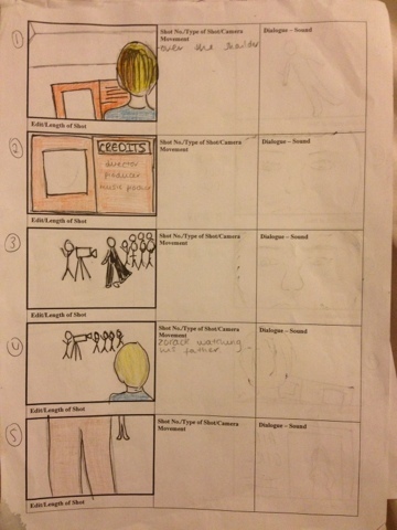
These are our storyboards that we created in class to give a guideline of what our filming and shots are going to be. The first couple of shots are of our shots are of the villain 'Zorak' these give a brief description of his childhood and the reason why is evil. We are then shown a series of people reading newspapers to represent the girls being famous and helping people, even in small tasks, individually saving the day. We are going to have a close up of the young Zorak into the current one. The end shot is Zorak putting down the newspaper and seing the girls form together, like in avengers. This shows the clear binary opposition of evil vs good.
This is an example of the newspaper of all the girls together which is presented later on in the title sequence. This hints our storyline as it shows them together in this but seperate in the others we have made.
One of the props used in our title sequence. Throughout the title sequence we have many people looking at newspapers about the fantastagirls. This is to show their individually and later on we have a newspaper of the girls together.
Out of the 4 parts; cinematography, directing, design and props, and location and makeup, i got chosen to do design.
we each had a vote to see what would suit us best. From this I'm now the design and prop. so far i have created props for the title sequence and the cast list is pending. So far we have made a sequel of when and where we are filming.
Props:
Camera
Tripod
Newspapers
Dolly
Magazine
Ipad
I have took the feed back and edited my blog. i have added things that have been missing. Labels can be added to make it easier for the person viewing it, this means that people can go straight to the place they want to. I have also made a label for my Journal so that when we do something new on our project i can write a post about what has been done and whether there was any problems.
There is an immediate indication that the film is directed towards children. It stars with an up beat music; this can give viewers an exciting feel to the film. A high-pitched ringing song, which alerts the viewer.
The typography of the title is used in red. This could symbolise the danger in the film, as we know the film is a children’s action film. The title is bold which goes in at the middle. This again shows the connotations of a children’s film. A light then over covers this. It gives conventions of a stereotypical superhero.
Each individual superhero is shown and their powers. This gives each superhero there own chance to show off and give an insight to what the film is going to be about.
The incredible a title sequence is a cartoon animation, through out the title sequence the animation continues but the animation becomes extremely fast so the animation looks almost like shapes. This is also used to show the actors names layered over the top. This relates to Saul Bass's work with shapes in title sequences. The shots are shown short and quick and in each shot their is a different character pulling a fighting pose, and this could relate to children's books, the one image on each page. This shows the viewers the main characters and their different powers that might come with the film; also the characters are punching towards the screen that brings back the connotations of an action film. When this happens the tempo in the music goes up with it to link with the action and gives a greater effect.
You also see the villain throughout the shots and this also reinforces the genre of the film.
The director’s names and other characters in the film have been placed into bold and solid typography, it appears almost as if it has been written in italics, which looks as if it has a fast movement, this could indicate what is yet to come in the film. The general order of the films is what is expected in a title sequence. Showing who the film is made by first and the actors next. This is so the audience know who it is made by, this could also give an idea of what the film is about if the audience knows of their work.
The sequence itself focuses you to pay attention as each shot is fast and bright. This reinforces the idea that it alerts the reader. When the design people are shown, an image of the work is shown. For example when the music producer is shown there are music notes above so you know what it is going to be without reading it. Although the sequence is a animation it still uses shot types to help show the characters. For example when a villain is shown a low angle shot is used to make him look powerful and inferior.
Shots are made for shot already on screen this makes the sequence snappy and fast. While still leaving hints of what is going to happen during the film.
Theses are the two types of typography sansSerif and Seif
Serif is Sans serif
with a flick type ends onto the bottom of the lettering which is used to make the font look more professional. This can be used if someone is trying to make the typography look as if its been written on a type writter.
Our pitch for fantasta girls went well and I am happy with what we achieved. We included: genre, narrative, target audience, characters, details on the character Zorack, the budget, underlying messages and the director. However missed out some important details like the music producer which we have now researched into.
We had criticism from the class, which was the target audience.
We have changed our main target audience to a younger group, and we are then going to have a secondary audience which will be for a older group, for example parents who was be going to watch the film with their children or teenagers. From doing the pitch we have also come up with more ideas for our title sequence.
The Budget for our film is £35,000,000 and we have estimated a profit of
£80,000,000. We have researched in a film similar to ours such as 'Sky High'
and we have estimated the budget and profit around this film.
Our primary audience is a younger audience we can produce
merchandise out of it which can also be a benefit in the profit. We may also make apps which could make us gain more money.
Underlying messages within the film:
- friendship, the disruption of loneliness; the impact family has; and jealousy.
Our primary target audience is for the film is for girls up to the ages
of 13. We also think that the film can be targeted at family audiences
too.
The release date of our film is going to be in August 2013, this is
because it will be in the summer holidays and it will be more suitable
for children to see it.
The Director of the film is Mike Mitchell because he has previously made
films that are similar to ours. For example: Sky High(superheroes) and
Alvin and the chipmunks(younger audience)
i was pleased with the feedback we were given. i think our film does need some work but with the feed back on the sheets we can improve. we have already put thought into what people have said and even researched further into some things. We got mostly 2 stars which i was very happy with. Our target audience has now been lowered to 5-15 with the acceptation that parents would go with their children when it comes out in cinema. Our director has also been changed to Mike Micheal.
i was pleased with this. i foley sounds were effective and gave the effect we wanted. we had no planned script so the film was spontaneous. this then resulted in swearing. This has now been bleeped out to not offend those who watch it. we used a range of shots however the last bit of the film we run out of time and therefore the shots aren't so good. This, however, will help us when filming our coursework to time it before we film. we used raw meat to give the slap effect, and a melon for the punch.
Avengers title sequence analysis.
The genre of the film
is being constructed by the constant images of weapons this is shown
throughout but also is the first image to appear. A shield is shown
close up so it is more intense. There is a dark background that shadows
over the shield. The camera moves around the shield, showing every inch
of it to make the audience feel as if they are there. The shield is
damaged as if it has been used in a battle, bringing back the idea that
it is portraying what is going to happen, the darkness shows negative
connotations to show the characters have been beaten rather then in
power.
The genre of the music is action. Its is very upbeat to fit in with the
shots. The music is intense to show to the audience that something big
is going to happen during the film.
It starts of with a
sudden sound as if metal is hitting metal which links to the typography
of ‘joss whedon’ in bold shinny metal, and then switches to an image of
captain America’s shield. The sudden clash of the metal draws attention
for the audience straight away. It also relates to each character as
each have some short of metal in their weapons or armor. The music
begins with the theme tune to show what will outline throughout the
film. The music is very upbeat and in focus with the images.
Throughout the film the same typography is used, bold shiny metal, which
refers back to the hero’s outfits in the film. This again fits in with
the sound of metal heard earlier on to reinforce the idea of the
superhero's having that one thing in common.The bold gives the elision
of power and something bigger.
Each character is shown through their outfits, captain America is shown
first as he was the first avenger. The actors name appears beside it so
the audience know what to expect. The transitions between are fast
bringing back the codes and conventions of an action film. Even though
the characters are shown the close ups divide their individuality and
show the strengths.
After the outfits of the characters
are shown we are then shown the typography. The image in the background
is then into fade and the main focus is on the typography. this gives
credit to the producers. Each costume is shown damaged which shows they
have all been damaged in battle. Although we are shown the costumes we
are not show the characters them selfs which suggest the audience would
have to wait to see them until the fit, again building up tension.
when story boarding it was different to how it end it up being filmed. the shot were meant to be more preside and there was meant to more different ones. However when it can to film we discovered it was a lot different. i think we was more concentrated on getting it done the focusing on the shots. This resulted in some of the shots looking as if they were jumping. individually i think i did better on the editing, i slowed down the extreme close ups and ran a westerned theme music over the top of it to create suspense. i think it would have been better if it was more carefully planned out. however on the next task will help me to learn from this.
Analysis; The Game Title Sequence
Setting:
From the Title Sequence -
countryside
summer
60's-70's
birthday party
old fashioned, black and white
Themes:
Drama
Crime
Identity - father figure
Style:
Dull colours
Prologue
Music - classical, slow, represents loneliness from the
piano
Clips - memories
Slow editing, reminiscent
Editing - puzzles, relates to the title 'the game' - puzzle
he has to fit suggests story line of trying to fix his life, put back the
pieces - is it to do with his childhood - creates an enigma for the
audience
Burn out on clips, suggests old camera
Narrative
Game - life
Haunted by his past
Relationship with dad isn’t good
Past has made him who is he is current, impacted
- he regrets
something from his childhood
- something dramatic
in his childhood has happened which has had an affect on his life
Zombie land
The first image we are presented with shows the company who created the film. There is a plain black background with blood splashed across the front. This already shows connotations of a horror film.
The music throughout is considered as action or horror, and gives insight about what to aspect in the film. The music brings suspense and leaves you waiting for something to happen.
The image shown is the first to be more different to the others. The colour red is used for the gun to show more blood shed or danger. The image gives as the illusion that the actor is either one to be feared or a hero.
More images are show of actors names with blood. The transitions between are fast paced and/or spinning. This again brings forward the idea that there is going to be a lot of action.
The image suggest the actor is going to be a target or the one they are after as shown by the target behind the name.
"They have always served a greater
purpose than themselves: to move the overarching story forward." – The article speaks the truth. Is
says about the title having a greater meaning behind it then just showing the
film. no characters are shown and it doesn’t give credit to the people who made
the film, but has a 'greater purpose' which gives a story line of the film. I
think this hints of aspects, which will be in the film and sometimes slightly
portrays the narrative of the film itself.
"we see the emergence of
typography that seeks to match letterforms with the subject matter and even the
zeitgeist" & "It could be argued that typography lost importance
in this era of title design." - The typography within a title sequence also can show the
genre of a film. A film name with the right typography, analysing it can set up
the whole theme that would be held in the film. The typography itself does
'match' the narrative and genre of the film; which I think is very important
for audiences.
“As
much as possible, they liked to convey the tone of a movie through the
“dressage” of its main title”
The quotation shows the films audience, people who wish to see a film will
often judge it on their first impressions and that comes under the title name
and the way the title presents the film.
“It could be argued that typography lost importance in this era of title
design. The imagery behind the credits received a lot more attention”
The quotation is interesting because a lot of people see a film for its
typography, but the imagery is very important in a film as well, this also
gives away the genre and an in sight into the film. The imagery also draws the
audience to see the film as they wish to find out later in whom that person or
what the image is of and how it ties in with the story line and the selected
title.